


Your Transaction Growth Is Lying to You
Two Metrics to Measure What Really Matters: Behavioural Shift


A handful of blockchain teams found themselves in a familiar situation.
Growth was slow. Users weren’t sticking. Community vibes were weak.
So they turned to the most popular fix: points, quests, and other forms of gamification.
Within weeks, things looked incredible.
Millions of transactions. Hundreds of thousands of users.
Dashboards lit up green. Teams were celebrating.
Until the airdrop.
(Or in some cases, the end of incentivized quests.)
Then the quest crowd disappeared.
One mistake?
They were tracking the wrong metrics.
Quest systems aren’t magic. They don’t create loyal users.
They attract curious, exploratory, often opportunistic users.
That’s not a bad thing. In fact, that’s the entry point.
The program’s real job starts after they arrive.
It needs to convert attention into behavioural shift.
And most teams? They never measure whether that shift is happening.
They lose time, capital, and a community that helped build their momentum, only to feed bots and farmers.
What could they have done to spot this in advance and prepare for it?
Track two metrics that reveal wallet behaviour:
Real TX Count: The Macro View
BS Score: The Micro View
(Yes, BS stands for Behavioural Shift… but also Bullshit. It shows you if your program is real, or just noise.)
Real TX Count: The Macro View
For illustration purposes, synthetic numbers are used to mirror real-world behaviour.
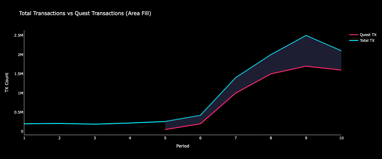
Let’s look at the first chart.

Transaction count per period was increasing, hitting millions. Of course the team would be happy to see this. Quests worked!
Looking at cumulative transaction chart, the team is even happier.

But something was hidden under the surface.
In the excitement, teams overlooked the deeper reality of what was actually happening.
They assumed that the spike in TX coming from transactional users (users who complete a quest in exchange for rewards) would stick around long-term.
They should have asked: what happens to transactions if we turn off quests tomorrow?
This is where the Real TX chart comes in.

By plotting Total TX vs Quest TX, you reveal the critical area: the space between the two lines. This area is your real TX count.
Your real metric. The one that matters.
If that area stays flat (as shown in the chart above), your program aren’t driving activity beyond the quest system.
And when quests stop, those TX go with them. No long-term value.
But teams missed this and kept going, thinking their program was succeeding.
The Illusion Breaks
And then, the chart that sets reality.

The moment an airdrop snapshot is announced, many wallets stop completing quests assuming their actions no longer affect the outcome.
Some continue briefly, hoping their points still matter.
I interviewed users after snapshots who knew there were no further rewards, but kept going just in case.
But the majority dropped off quickly.
Snapshots are the first obvious signal of real user intent.
But by then, it’s often too late.
After the short spike caused by the airdrop distribution, teams are left with nearly the same TX count as before.
Quests stop. TX falls. The illusion breaks.
What Should Have Happened?
The team enjoyed a short-term win. But that wasn’t the purpose of quests.
The goal was to increase real TX count, the area between the two lines.
I once interviewed a farmer who told me, “Farming airdrops is my full-time job.”
These users leave as soon as they’re rewarded.
Their behaviour isn’t what you’re looking for.
What you want to see instead are wallets that start exploring your project outside of the quest system.
That’s what loyalty looks like.
And it would’ve shown up in your chart as an expanding area between Total TX and Quest TX.
That's the win. That’s what you chase.
This is how the chart should have looked if the program was succeeding.
Traditional loyalty program research consistently shows: loyal users transact more. They buy more. They interact more. They promote more.
Here’s a source
That’s the job of your program:
acquire through quests and incentives, retain through loyalty.
BS Score: The Micro View
Real TX Count gives you the macro view, the system-level signal.
But how do you measure if your program is working at the wallet level?
Calculate the BS score.
BS Score= Behavioural Shift
(or Bullshit, because it shows you if your program’s real, or just BS.)
BS = Total TX / Quest TXIf that ratio is ~1 over time, the wallet is only doing quests.
That could mean that your program isn’t working, or is attracting purely transactional users.
But if the BS Score increases over time?
That’s a strong signal that your program worked.
The user stayed. They explored.
BS gives you a wallet-level view of behavioural shift.
You can swap transaction count with whatever matters most in your ecosystem:
Gas spent
Transaction Volume
Unique contracts interacted with
Stake amount vs required stake
Tune the inputs.
The principle stays the same: track behaviour beyond the quest.
Here’s how that looks:

Left: Transactional behaviour (flat ratio, BS ≈ 1 )
Right: Loyal behaviour (increasing ratio, BS > 1)
This metric is powerful. It helps:
Diagnose user behaviour early
Spot what’s working (and what isn’t)
Potentially filter wallets for airdrop criteria
What Should You Look For?
A Behavioural Shift.
Loyal users transact more, explore more, and stick around.
If your quest system sparks that shift, it’s doing its job.
But if activity drops the moment incentives stop, the signal is clear:
you didn’t build loyalty. You just rented attention.
Incentives should be the entry point, not the endgame.
Redirect users into parts of your product that don’t rely on rewards.
Encourage discovery. Turn curiosity into conviction.
It’s better to delay your airdrop until you see the behavioural shift than to waste it on users who were never really there.
(PS: Don’t share those criteria publicly. Farmers adapt.)